- Images are the largest component of most web pages. A single uncompressed 5MB photo can add 5 seconds to load time. Compressing to 200KB drops that to 0.2 seconds.
- Lossy compression discards invisible data. At quality 80-85, the result is indistinguishable from the original for most viewers. Achieves 60-90% file size reduction.
- WebP is the modern default. 25-35% smaller than JPEG at the same quality. Supports transparency and animation. 97%+ browser support in 2026.
- AVIF achieves maximum compression. Approximately 50% smaller than JPEG. Uses the AV1 codec. 94-95% browser support. Use with WebP and JPEG fallbacks.
- Resize before compressing. A 4000px image displayed at 800px carries 20x more pixel data than needed. Proper resizing alone reduces file size by 80% or more.
- Format selection matters more than quality settings. Using PNG for photos increases file size by 5-10x. Using JPEG for graphics creates artifacts around text.
- Target file sizes by context. Hero images: 200-400KB. Content images: 50-150KB. Thumbnails: 10-30KB. Icons: 1-5KB.
- Compression directly impacts SEO. Faster images improve Largest Contentful Paint (LCP), a Core Web Vitals ranking factor. Compressed images also reduce bounce rates.
Why compress images
Uncompressed images waste bandwidth, storage, and user patience. Here is why every image needs compression.
Images account for 50-70% of total page weight on most websites. A single uncompressed photo from a modern camera can be 5-15MB. When a visitor loads your page, their browser must download every image before the page is fully rendered. On a 3G connection, a 5MB image takes over 10 seconds to load. On mobile data, it consumes a significant chunk of the user's data plan. Compression is the single highest-ROI performance improvement for any website.
Faster page loading
Google uses page speed as a ranking factor. 53% of mobile users abandon sites that take longer than 3 seconds to load. Compressing images from 5MB to 200KB can cut load time from 5 seconds to 0.2 seconds.
Reduced storage costs
Cloud storage, CDNs, and backups charge by the gigabyte. A portfolio of 100 uncompressed photos at 10MB each consumes 1GB. Compressed to 200KB each, that drops to 20MB. A 50x reduction.
Email deliverability
Email attachments have size limits of 10-25MB. Large emails trigger spam filters. Compressed images load faster in email clients and avoid clogged inboxes.
Mobile data savings
Mobile users pay for data. A 10MB image on a phone consumes 10MB of the user's data plan. A compressed version at 300KB uses 97% less data. Users on limited plans are especially sensitive.
Better SEO rankings
Core Web Vitals measure page speed as a ranking factor. Image compression improves Largest Contentful Paint (LCP). Faster sites get crawled more frequently and rank higher.
Bandwidth conservation
High traffic with large images can exhaust bandwidth quotas, causing slowdowns or extra charges. Compressing by 80% means 80% less bandwidth usage. The savings multiply with every visitor.
I compress every image before uploading, no matter what. My rule: compress first, then upload. Even professional photographs can be compressed 30-60% without visible quality loss. Keep originals in an "originals" folder and compressed versions in a "web" folder. This two-folder system preserves the source while optimizing delivery.
How compression works
JPEG throws away detail your eyes skip over, PNG keeps every pixel — know which engine does what before you touch the quality slider.
JPEG compression (Discrete Cosine Transform)
JPEG divides the image into 8x8 pixel blocks. Each block is converted from spatial data to frequency data using DCT. High-frequency components (fine detail) are quantized more aggressively than low-frequency components (smooth gradients). The "quality" setting controls this quantization. Lower quality means more data discarded. The result is then encoded with Huffman coding. This is why JPEG works well for photos but poorly for text and sharp edges.
PNG compression (DEFLATE algorithm)
PNG uses the DEFLATE algorithm, a combination of LZ77 dictionary compression and Huffman coding. It finds repeated byte sequences and replaces them with references. PNG also uses predictive filtering. Each pixel is predicted from its neighbors, and only the prediction error is stored. This is lossless: every pixel is preserved exactly. PNG works best for images with large areas of solid color, text, and simple graphics.
Modern codecs: WebP and AVIF
WebP lossy uses predictive coding and block prediction, borrowing techniques from video compression. It achieves 25-35% smaller files than JPEG at equivalent quality. AVIF uses the AV1 intra-frame codec, which supports advanced tools like adaptive block quantization and constrained directional enhancement. It achieves approximately 50% smaller files than JPEG. Both formats support lossless compression, transparency, and HDR.
Chroma subsampling
The human eye has more brightness receptors than color receptors. JPEG and video codecs exploit this by reducing color resolution more than brightness. 4:4:4: No reduction. Every pixel has full color. Best for text and graphics. 4:2:0: Color reduced to 1/4 resolution. 75% of color data removed. Standard for most web images. Good for photos, not ideal for text. 4:2:2: Color reduced to 1/2 resolution. 50% removed. Middle ground.
Lossy vs lossless compression
The fundamental choice in image compression and how to decide which type to use for each image.
Lossy compression permanently discards data that humans are less likely to notice. It exploits limitations in human vision. We are more sensitive to brightness than color, and more sensitive to low-frequency detail than high-frequency detail. At quality 80-85, the discarded data is invisible to most viewers. This achieves 60-90% file size reduction for photographs.
Lossless compression stores data more efficiently without discarding anything. The original can be perfectly reconstructed. PNG uses DEFLATE (LZ77 + Huffman). WebP lossless uses predictive filtering and entropy coding. It achieves 20-50% file size reduction for graphics, but only 10-30% for photographs.
| Feature | Lossy (JPEG, WebP lossy, AVIF) | Lossless (PNG, WebP lossless, GIF) |
|---|---|---|
| Data | Permanently discards invisible data | Preserves every pixel exactly |
| File size reduction | 60-90% for photos | 20-50% for graphics, 10-30% for photos |
| Best for | Photographs, complex images, web delivery | Graphics, text, logos, screenshots, transparency |
| Reversible | No. Original cannot be recovered | Yes. Perfect reconstruction |
| Quality control | Adjustable quality slider | No quality loss at any setting |
| Typical formats | JPEG, WebP lossy, AVIF lossy | PNG, WebP lossless, GIF, SVG |
Use lossy for photographs, hero images, product photos, social media graphics, and any image where file size matters more than pixel perfection. Use lossless for logos, icons, text-heavy images, screenshots, diagrams, medical images, and any image where pixel-perfect accuracy is required. When in doubt, try both and compare file sizes and visual quality.
Image formats explained
Choosing the right format is more important than any compression setting.
| Format | Compression | Transparency | Best For | Size vs JPEG |
|---|---|---|---|---|
| JPEG | Lossy only | No | Photos, legacy, email | Baseline |
| PNG | Lossless only | Yes (alpha) | Logos, UI, screenshots | 3-5x larger |
| WebP | Both | Yes | Default for web | 25-35% smaller |
| AVIF | Both | Yes | Max compression | ~50% smaller |
| GIF | Lossless | Partial | Simple animations | Varies |
| SVG | Vector | Yes | Icons, logos, diagrams | Tiny |
| HEIC | Lossy | Yes | Apple ecosystem | ~50% smaller |
Browser support in 2026: WebP is supported by 97%+ of browsers. AVIF is supported by 94-95%. JPEG and PNG are universal. Use WebP as your default format with JPEG fallback for maximum compatibility. Add AVIF as the first source for modern browsers.
PNG for photos: A photo saved as PNG may be 5-10x larger than JPEG. Use JPEG or WebP lossy for photographs. JPEG for logos: JPEG creates artifacts around sharp edges and text. Use PNG, WebP lossless, or SVG for logos. GIF for video: Large animated GIFs waste bandwidth. Convert to WebP animation or MP4/WebM video.
Quality settings guide
The right quality setting depends on the image type, display context, and file size target.
| Image Type | Format | Quality | Target Size |
|---|---|---|---|
| Hero / banner | WebP / AVIF | 75-85 | < 400KB |
| Product image | WebP | 80-90 | < 150KB |
| Blog content | WebP | 75-85 | < 100KB |
| Thumbnail / card | WebP | 65-75 | < 30KB |
| Background (decorative) | WebP | 60-75 | < 500KB |
| Screenshot | PNG / WebP lossless | N/A | < 100KB |
| Logo (raster) | PNG / WebP lossless | N/A | < 20KB |
| Logo (vector) | SVG | N/A | < 5KB |
| Icon / favicon | SVG / PNG | N/A | < 10KB |
Compress at quality 80, compare to original at 100% zoom. If you can see differences, raise to 85. If you cannot see differences, lower to 75 and check again. The goal is the lowest quality setting where you cannot tell the difference from the original. For most web photos, this ends up being 80-82. For product photos where customers zoom in, use 85. For social media where images are viewed small, 70-75 is fine.
Resize before compressing
The most impactful single step and why dimensions matter more than quality settings.
A 4000x3000px photo displayed at 800x600 carries 25x more pixel data than needed. No amount of compression can fix this efficiently. Resizing to the actual display dimensions first is the single most effective optimization. It is also the step most people skip.
| Display Context | Max Width (Standard) | Max Width (Retina 2x) |
|---|---|---|
| Full-width hero | 1440px | 2880px |
| Content column | 800px | 1600px |
| Product image | 1200px | 2400px |
| Blog sidebar | 400px | 800px |
| Thumbnail / card | 400px | 800px |
Identify the display size
How large will the image actually appear on screen? Check your CSS, layout, or content width. A typical blog content column is 700-800px wide. A hero section might be 1440px. Never serve an image wider than its display container.
Account for Retina displays
High-DPI (Retina) displays have 2x the pixel density. Serve 2x the display size for crisp rendering. For an 800px content column, serve 1600px for Retina. For a 400px thumbnail, serve 800px. This balances sharpness with file size.
Sharpen after resize
Downscaling can soften images, especially fine details and edges. Apply subtle sharpening after resizing for crisp results. Most image editors and tools like Sharp (Node.js) support this. The amount depends on the image. Start with a small radius and increase if needed.
Proper resizing alone can reduce file size by 80% or more. A 24MB camera original resized to 1200px for web typically becomes 200-400KB after compression. The same image compressed at full 24MP resolution would be 2-4MB even at quality 80. Always resize first, then compress.
Step-by-step compression workflow
Resize, pick the format, dial in quality, hit the KB target — the order that works for every image, camera photo or screenshot.
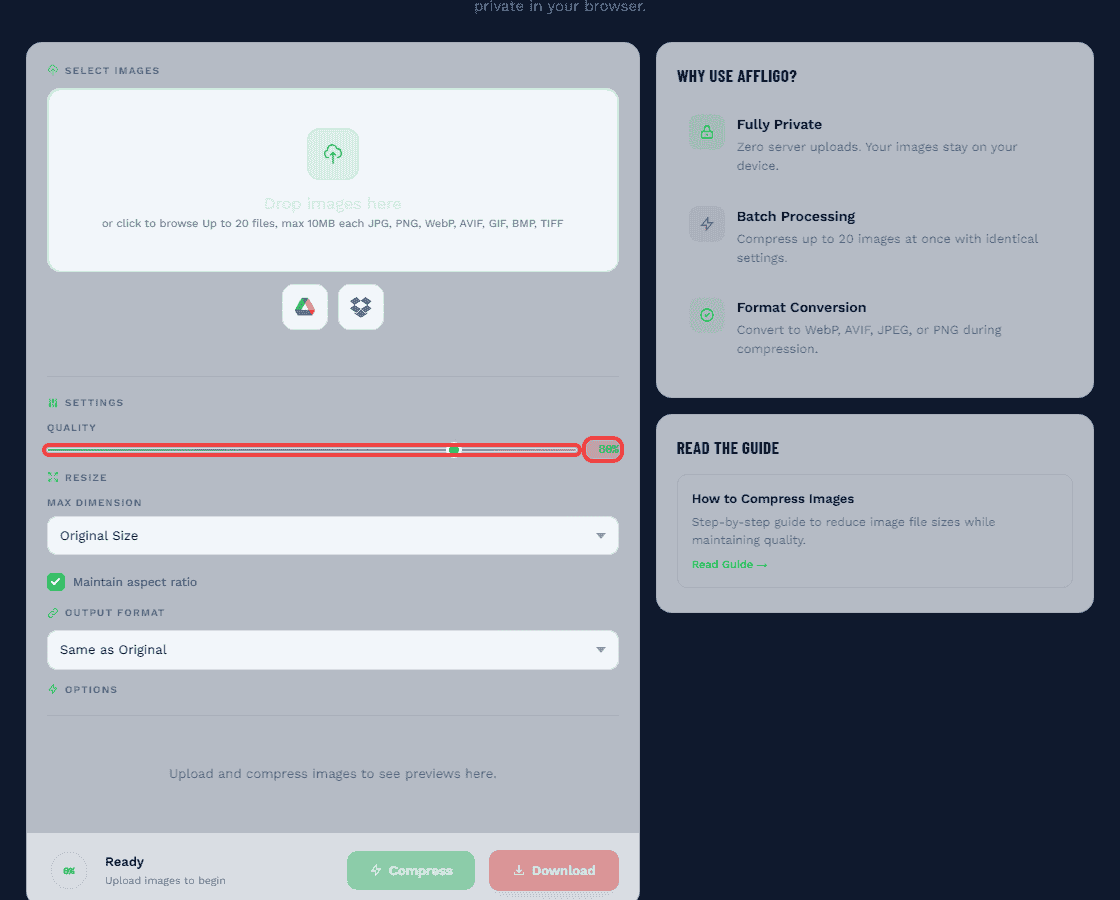
Choose the right format
Before compressing, select the optimal format: Photographs: JPEG or WebP lossy. Graphics with transparency: PNG or WebP. Simple graphics: PNG or WebP lossless. Maximum compression: AVIF with WebP and JPEG fallback. Format selection is more important than compression settings.
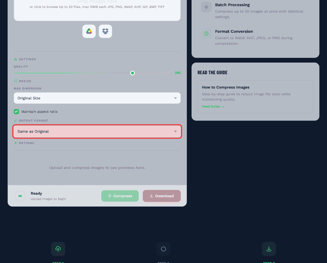
Resize to display dimensions
Identify the maximum display width. Consider device pixel ratio (2x for Retina). Resize the image to these dimensions. Do not over-resize. A 400px image stretched to 800px looks blurry. For responsive images, create multiple sizes (400w, 800w, 1200w) for different screen widths.
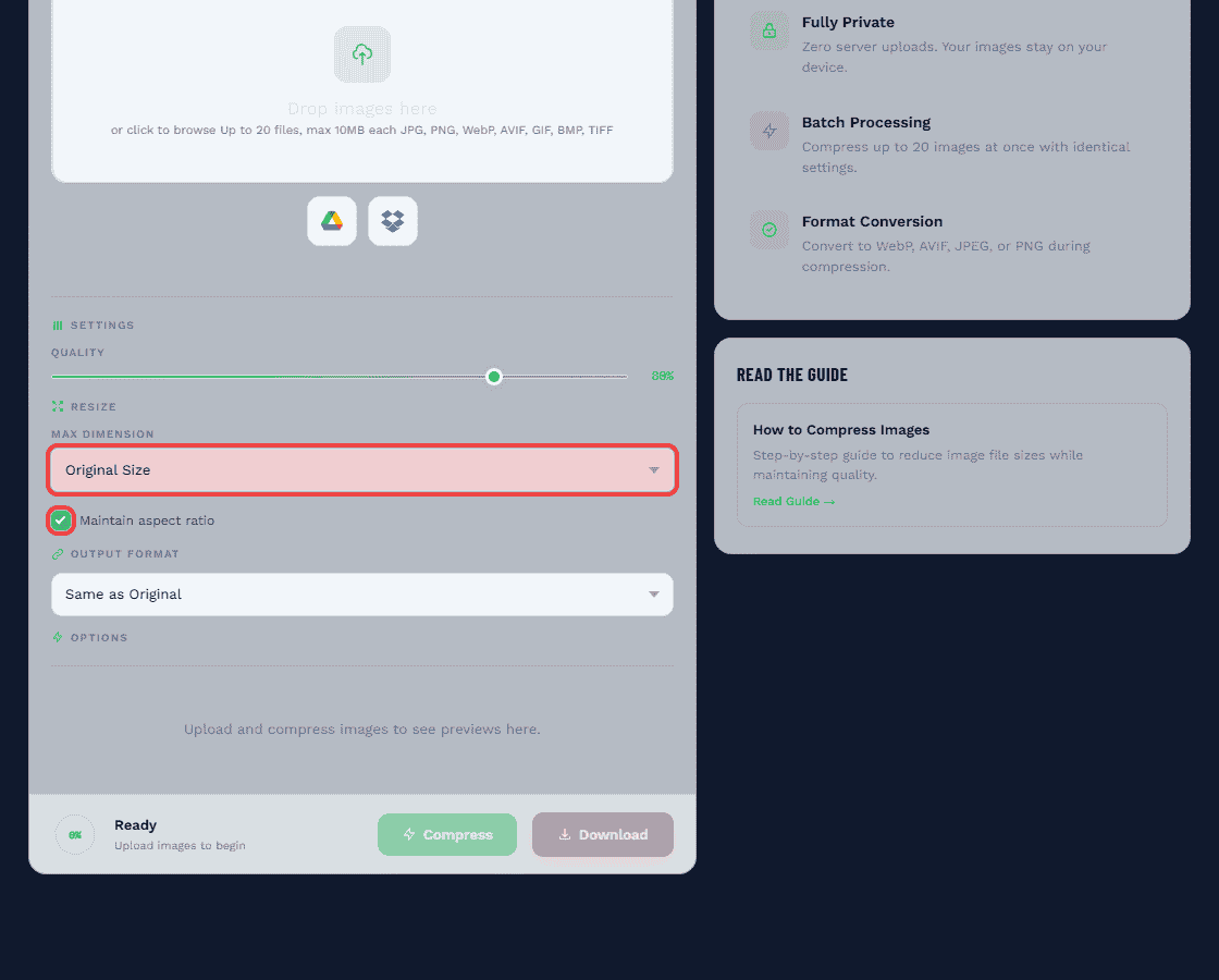
Apply compression settings
For JPEG: quality 80 for standard web, 85 for hero images, 60-70 for thumbnails. For WebP: quality 75-80 (equivalent to JPEG 85). For PNG: maximum compression level (level 9). Strip EXIF metadata (GPS, camera info) to save 5-15KB per image. Enable progressive encoding for JPEG.
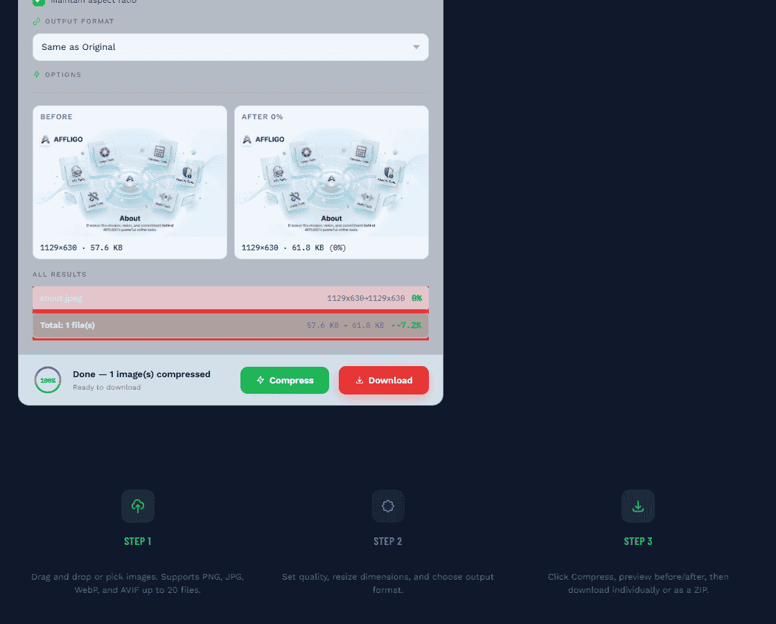
Verify before publishing
Compare original and compressed side-by-side at 100% zoom. Check faces, text, fine details, gradients, and color accuracy. View on mobile devices. If compression artifacts are visible, raise quality or try a different format. Sometimes switching from PNG to WebP achieves better results than higher quality settings.
Web optimization strategies
Compressing images is only part of the solution. Delivery optimization is equally important.
Responsive images with srcset
Use the HTML srcset attribute to provide multiple image sizes. The browser downloads the most appropriate size based on screen width. This prevents mobile users from downloading desktop-sized images.
Lazy loading
Only load images when they enter the viewport. Add loading="lazy" to img tags for below-fold images. Reduces initial page load by 30-50% for long pages. Never lazy load the hero/LCP image.
Modern format serving
Output WebP here, then serve it with JPEG fallback via the picture element. Full fallback code lives in the Image Converter guide.
CDN and caching
Serve images from a CDN with edge locations close to your users. Set Cache-Control: public, max-age=31536000 for versioned image filenames. Enable Brotli or Gzip for HTML and CSS.
Responsive images and srcset
Serve the right image size for every device and cut mobile data usage by 60-80%.
The srcset attribute tells the browser which image size to download based on screen width. Combined with the sizes attribute, it lets the browser calculate the optimal size before downloading. This prevents a mobile user from downloading a 1200px desktop image when they only need 400px.
Create multiple sizes
For each image, create 3-4 versions at common widths: 400px (mobile), 800px (tablet), 1200px (desktop), and optionally 1600px (large desktop / Retina). Compress each version separately with format-appropriate settings.
Add srcset and sizes
Use srcset="image-400w.jpg 400w, image-800w.jpg 800w, image-1200w.jpg 1200w" to list available sizes. Use sizes="(max-width: 600px) 400px, (max-width: 1000px) 800px, 1200px" to tell the browser how large the image will display at different viewport widths.
Add format fallback once, reuse everywhere
Pair this srcset with one picture-element fallback (AVIF → WebP → JPEG). Copy the snippet from the Image Converter guide instead of rebuilding it per image.
Lazy loading and fetchpriority
Load images only when needed and tell the browser which image matters most.
Lazy loading defers off-screen images until the user scrolls near them. This reduces the initial page load by only loading the images the user actually sees. Combined with fetchpriority, you can tell the browser to load the most important image first.
loading="lazy"
Add to all below-fold images. The browser delays loading until the image is within ~1250px of the viewport. Reduces initial page weight by 30-50%. Never add to the hero/LCP image.
loading="eager"
The default behavior. Use explicitly on above-fold images, especially the hero/LCP image. Tells the browser to load the image immediately without delay.
fetchpriority="high"
Add to the single most important image on the page (usually the hero/LCP image). Tells the browser to prioritize this image over other resources. Can improve LCP by 10-20%.
decoding="async"
Add to all images. Tells the browser to decode the image off the main thread, preventing it from blocking other page rendering. Improves overall page responsiveness.
Do not add loading="lazy" to the hero/LCP image. This delays the most important visual element on your page and hurts your Largest Contentful Paint score. The LCP image should use loading="eager" and fetchpriority="high".
Modern format serving with fallbacks
Serve the best format each browser supports, with automatic fallbacks for older browsers.
The HTML picture element enables progressive enhancement for image formats. List AVIF first (best compression), then WebP (wide support), then JPEG (universal). The browser picks the first format it supports. Users on modern browsers get 50% smaller files. Users on older browsers still see the image.
The picture element structure
Wrap your img tag in a picture element. Add source tags for each format in order of preference: AVIF first, WebP second, JPEG as the img fallback. The browser automatically selects the first format it supports. No JavaScript required.
Server-side format detection
Some CDNs (Cloudflare Polish, ImageKit, Cloudinary) automatically detect browser support and serve the best format. This eliminates the need for the picture element. Check the Accept header to determine format support.
Build-time conversion
Use tools like Sharp, Squoosh CLI, or libvips to convert images to multiple formats during your build process. Generate AVIF, WebP, and JPEG versions of each image. Reference them in your HTML with the picture element.
CDN and caching
Compress once, serve from edge locations worldwide with optimal cache headers.
A CDN (Content Delivery Network) stores copies of your images on servers around the world. When a user in India requests an image, it comes from a server in India, not your server in the US. This reduces latency and speeds up delivery. Combined with proper caching, images load almost instantly on repeat visits.
Cache-Control headers
Set Cache-Control: public, max-age=31536000 (1 year) for versioned image filenames. When you update an image, change the filename or query string to bust the cache. This ensures images load from cache on repeat visits.
CDN with image optimization
Cloudflare Polish automatically optimizes images at the edge. ImageKit and Cloudinary provide on-the-fly resizing, format conversion, and compression. These services can replace your entire image optimization pipeline.
Brotli and Gzip
Enable Brotli or Gzip compression for HTML, CSS, and JavaScript files. Images are already compressed (JPEG, WebP, AVIF), so further compression yields minimal gains. Focus on compressing text-based assets.
Compression by use case
Different contexts need different compression strategies. Here is what works best for each scenario.
| Context | Format | Quality | Max Size | Notes |
|---|---|---|---|---|
| Website hero | AVIF / WebP | 75-85 | 200-400KB | Never lazy-load. Use fetchpriority="high" |
| E-commerce product | WebP | 80-90 | 100-150KB | Sharpness matters. Use srcset for zoom |
| Blog content | WebP | 75-85 | 50-100KB | Resize first. Lazy load below fold |
| Screenshot / tutorial | PNG / WebP lossless | N/A | < 100KB | JPEG destroys text clarity |
| JPEG | 70-75 | < 200KB each | Email clients reject WebP | |
| Social media | JPEG | 85-90 | Platform-specific | Platform will re-compress anyway |
| Thumbnail / card | WebP | 65-75 | 10-30KB | Viewed small. Aggressive compression OK |
| Logo | SVG | N/A | < 5KB | Vector scales to any size. Smallest possible |
Tools comparison
Upload-based tools send every photo to a server and meter free use — how a compressor that works inside your tab compares.
AFFLIGO Image Compressor
Free, browser-based. Hit an exact KB target (20KB, 50KB, 100KB) with binary-search quality targeting. Supports JPG, PNG, WebP, GIF, BMP, TIFF, HEIC, AVIF. Unlimited batch, metadata stripping, before/after preview. No installation required.
Squoosh (Google)
Free, browser-based. Side-by-side comparison. Real-time quality adjustment. Supports WebP, AVIF, JPEG, PNG. Best for comparing formats and finding optimal settings. Single image at a time.
Adobe Photoshop
Professional control. Save for Web (Legacy) with precise quality control. Supports all formats. Content-aware scaling. Batch actions. Best for professional designers and complex workflows.
ImageMagick
Command-line tool. Free, open source. Supports 200+ formats. Scriptable. Batch processing. Best for developers, automation, and server-side processing. Complex syntax.
Sharp (Node.js)
High-performance Node.js library. Fastest JPEG/WebP/AVIF encoding. Ideal for build pipelines and server-side processing. Used by Next.js, Nuxt, and other frameworks. Programmatic API.
WordPress plugins
ShortPixel, Imagify, Smush. Auto-compress on upload. Generate WebP/AVIF variants. Serve modern formats automatically. Best for WordPress sites. Some require API keys for bulk processing.
Advanced techniques
Professional techniques for maximum compression without visible quality loss.
Content-aware compression
Some advanced tools compress different parts of an image at different quality levels. Faces and text get higher quality. Backgrounds and sky get lower quality. This achieves smaller files with better perceived quality. AVIF and modern encoders support this natively through content-adaptive quantization.
PNG to WebP conversion
PNG files can often be converted to WebP with significant savings. Lossless PNG to lossless WebP: 20-40% smaller. Lossless PNG to lossy WebP: 50-80% smaller with minimal quality loss for most graphics. This is especially effective for UI elements, icons, and screenshots.
Metadata and EXIF stripping
Images often contain metadata that adds size without adding value: camera model, settings, GPS coordinates, timestamps, thumbnails, color profiles. Stripping EXIF data can reduce file size by 5-15KB per image. For privacy, remove GPS data before sharing images publicly.
Batch processing and automation
For large collections, automate compression: command-line tools (cjpeg, pngquant, cwebp), build pipeline integration, watch folders, CMS plugins, or API integration. Automation ensures every image is optimized without manual intervention. Set up once, benefit forever.
Common mistakes to avoid
Eight mistakes that waste bandwidth and hurt user experience.
Uploading camera originals
A 5-15MB camera photo on your website means 5-15 seconds of load time on mobile. Always compress to under 200KB before uploading. Resize first, then compress. This single habit eliminates 90% of image performance issues.
Using PNG for photographs
PNG is lossless and does not compress photos well. A photo saved as PNG may be 5-10x larger than JPEG. Use JPEG or WebP lossy for photographs. Reserve PNG for logos, text, and images with transparency.
Using JPEG for logos with transparency
JPEG does not support transparency and creates artifacts around sharp edges. Use PNG, WebP lossless, or SVG for logos. SVG is preferred because it scales to any size and is typically under 5KB.
Not specifying image dimensions
Always add width and height attributes to img tags. This allows the browser to reserve space before the image loads, preventing layout shift (CLS). Example: img src="photo.webp" width="800" height="600".
Lazy-loading the hero image
The hero/LCP image should use loading="eager" and fetchpriority="high". Lazy loading it delays the most visible element and hurts your Largest Contentful Paint score. Only lazy load images below the fold.
Recompressing already-compressed JPEG
Each compression of a JPEG adds more artifacts (generation loss). Always start from the original source. Never recompress a JPEG. Keep originals in a separate folder and compress from those.
Serving oversized images
A 4000px image in an 800px slot wastes 95% of the pixels. Resize to the actual display dimensions. For responsive images, use srcset to serve different sizes for mobile vs desktop.
Using JPEG for screenshots
JPEG compression creates artifacts around text and sharp edges, making screenshots unreadable. Use PNG or WebP lossless for screenshots, tutorials, and any image with text content.
While preparing this guide I compressed the same 2.4MB camera photo three ways: JPEG quality 80 landed near 320KB with no visible change, WebP quality 80 came out about 25% smaller still, and a PNG export of the same photo ballooned past 6MB. That single test is why this guide keeps repeating JPEG-or-WebP for photos, PNG for graphics.
SEO and Core Web Vitals impact
How image compression affects your search rankings and user experience metrics.
Google uses Core Web Vitals as a ranking signal. Three metrics matter: Largest Contentful Paint (LCP), First Input Delay (FID) / Interaction to Next Paint (INP), and Cumulative Layout Shift (CLS). Image compression directly impacts LCP, which is usually the largest image or video element on the page.
| Metric | Target | How Images Affect It |
|---|---|---|
| LCP | < 2.5 seconds | Largest image load time. Compress the LCP image aggressively. Use fetchpriority="high". |
| CLS | < 0.1 | Layout shift from images without dimensions. Always add width and height attributes. |
| INP | < 200ms | Image decoding can block interactivity. Use decoding="async" on all images. |
1. Compress all images to under 200KB. 2. Use WebP/AVIF with JPEG fallback. 3. Add descriptive alt text for accessibility. 4. Add width and height to prevent CLS. 5. Lazy load below-fold images. 6. Use fetchpriority="high" on the LCP image. 7. Serve responsive images with srcset. 8. Use descriptive file names (blue-widget.webp not IMG_2026.jpg).
Frequently asked questions
Common questions about image compression, answered from experience.
Yes. Lossless compression (PNG, WebP lossless) reduces file size without any quality loss. Lossy compression (JPEG, WebP lossy) reduces size by discarding some data, but at high quality settings (80-85) the loss is invisible to most viewers. For graphics with text, always use lossless compression for perfect quality.
WebP is the best all-around format. It supports both lossy and lossless compression, transparency, and animation. It achieves 25-35% smaller files than JPEG at the same quality. All modern browsers support WebP (97%+). For maximum compression, use AVIF with WebP fallback.
Compression depends on format and content. Photographs as JPEG: 60-90% reduction. Photos as WebP: 70-85% reduction. Graphics as PNG: 20-50% reduction. Photos converted to AVIF: up to 50% smaller than JPEG. Resizing before compression can add another 80% reduction.
Quality 80 is the sweet spot for most web use. Quality 60-70 for thumbnails and small images. Quality 85-90 for hero images and product photos. Quality 95+ for print. Quality 100 is almost never necessary.
PNG is lossless and does not compress photographs well. A photo saved as PNG may be 5-10x larger than JPEG. For photos, use JPEG or WebP lossy. PNG excels at images with solid color areas, text, and transparency.
Ship WebP first with JPEG fallback. The 25-35% saving is covered with code in the Image Converter guide — compress here, wire fallback there.
AVIF uses the AV1 video codec for image compression and achieves approximately 50% smaller files than JPEG. Browser support is around 94-95% in 2026. Use AVIF as the first source in a picture element, with WebP and JPEG as fallbacks.
Email clients have limited WebP support, so use JPEG at quality 70-75. Keep total email HTML size under 102KB. Compress images to the actual display size. Keep total email weight under 500KB for best deliverability.
Reputable tools like AFFLIGO process images in your browser using the canvas API — pixels are re-encoded on your own machine, nothing is uploaded to a server. For highly sensitive images, use offline desktop software like ImageMagick, Photoshop, or GIMP.
Lossy compression permanently discards data that humans are less likely to notice (JPEG, WebP lossy). It achieves 60-90% smaller files. Lossless compression stores data more efficiently without discarding anything (PNG, WebP lossless). It achieves 20-50% smaller files.
Image compression directly impacts Core Web Vitals, specifically Largest Contentful Paint (LCP). Faster-loading images improve LCP scores, which is a Google ranking factor. Compressed images also reduce bounce rates and improve user engagement.
Use the HTML picture element: picture > source srcset="image.webp" type="image/webp" > source srcset="image.jpg" type="image/jpeg" > img src="image.jpg". The browser automatically selects the first format it supports.
Hero images: 200-400KB. Content images: 50-150KB. Thumbnails: 10-30KB. Icons: 1-5KB. Total above-the-fold images should be under 500KB for good LCP. Use responsive images (srcset) to serve different sizes for mobile vs desktop.
Government portals usually ask for a JPEG photo under 20-50KB. Open the AFFLIGO Image Compressor, switch to Target File Size mode, type the exact limit (e.g. 50KB), and download. For best quality, resize the long edge to 600-1000px first, then apply the KB target — a smaller canvas needs less compression to hit a tiny size.
Compress to JPEG at quality 70-80 and keep the file under 200KB — WhatsApp recompresses everything it receives, so sending an already-small file means less double-compression blur. For profile photos, resize to around 640px on the long edge first. Avoid PNG for photos: it stays large and WhatsApp converts it anyway.
Pick the right format first (JPEG or WebP for photos, never PNG), resize to the actual display width, then compress at quality 80 and compare at full zoom. If you need an exact size, use a target-KB mode — the AFFLIGO Image Compressor can land on 20KB, 50KB, or 100KB while keeping the highest quality that still hits the limit.
Key Takeaways
- Images are the largest component of most web pages. A single uncompressed 5MB photo can add 5 seconds to load time.
- Format selection matters more than quality settings. WebP is 25–35% smaller than JPEG. AVIF achieves 50% smaller.
- Resize before compressing. A 4000px image displayed at 800px carries 25× more pixel data than needed.
- Quality 80 is the sweet spot. For most web photos, quality 80–85 is indistinguishable from the original.
- Use responsive images with srcset. Serve different sizes for mobile vs desktop to cut mobile data by 60–80%.
- Lazy load below-fold images. Add loading="lazy" to off-screen images. Never lazy load the hero/LCP image.
- Compression directly impacts SEO. Faster images improve Largest Contentful Paint (LCP), a Core Web Vitals ranking factor.
- Always compress before uploading. Platform compression is often aggressive and unconfigurable.

Karan Kumar


